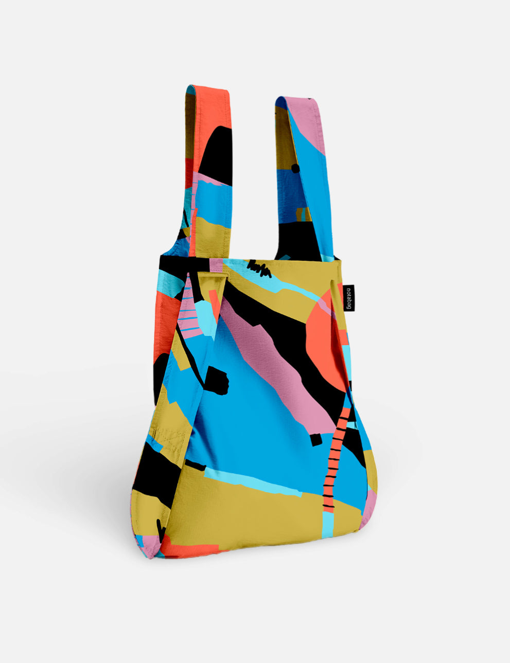

Smart. Simple. Good.
New look, same mission: minimalist design speaks the loudest when it’s done with intent. The 2025 update stays true to Notabag’s authentic, design-driven roots while refining the logo to feel smarter, bolder, and more authentic.
At first glance, it still feels familiar, like it’s always been this way. However, thoughtful adjustments improve balance, clarity, and adaptability. A subtle change that creates a bolder look.
Where It All Started
2012 marked the beginning of our journey. The original Notabag logo captured our vision:
Simplicity, practicality, and smart design. A bold start for a brand rooted in versatile design.
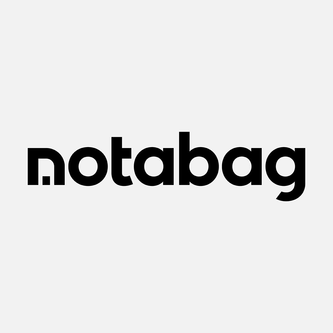
The First Evolution
By 2019, Notabag had grown and so had our design sensibility.
This first update embedded the bag into the negative space of the "n", simplifying the logotype while preserving its original spirit.
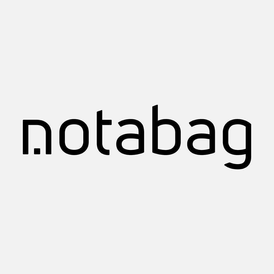
A Bolder Look
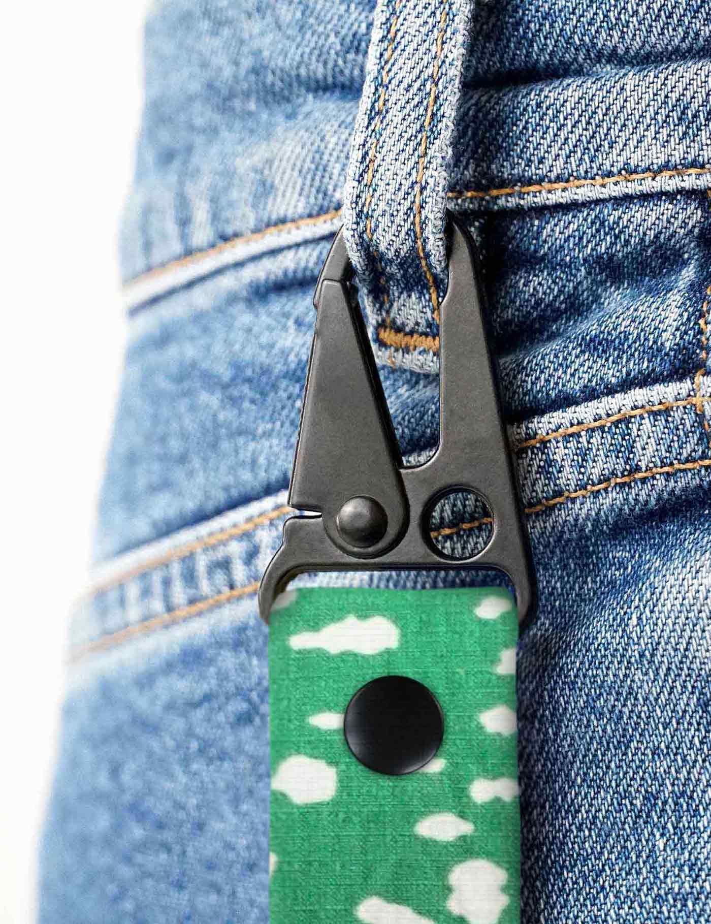
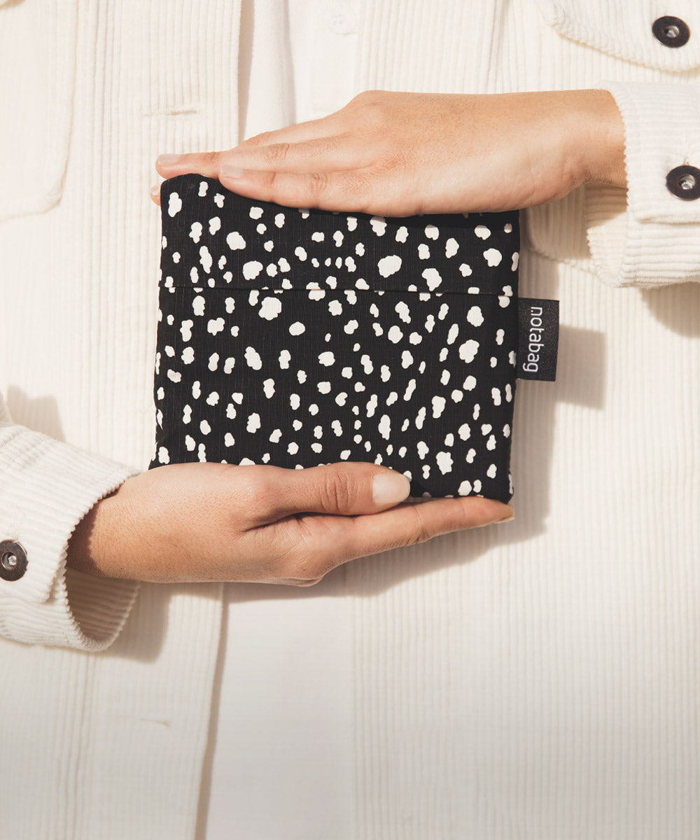
With the 2025 update, we want to make a statement. A bolder look that reflects our values. Notabag is a brand built on care, not profit. A movement toward smarter, easier living.
Join us on our journey to simplify daily life through smart and quality products.
The Story Behind the “n”
The iconic Notabag “n” carries subtle details from our history and identity.
In the negative space, you’ll find a reference to our first product, the Bag & Backpack. It also reveals the letter “A,” a quiet tribute to our founder, Adnan Alicusic.
These two elements come together in a simple, thoughtful mark that reflects our values. It represents innovation, simplicity, and the spirit of Notabag’s design.
Smart. Simple. Good.
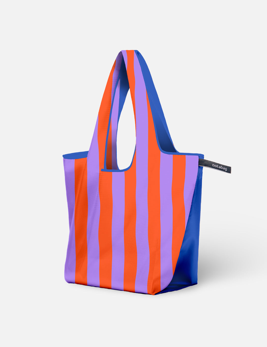
Experience the new Notabag
Are you ready to join the Notabag movement toward smarter, simpler living?
Discover Notabag ProductsDiscover Our Products